
COVINGTON, Ga. – After an extensive process, the City of Covington unveiled its new logo Monday night, designed to depict the city’s goal of being the south’s premier destination to live, work and play.
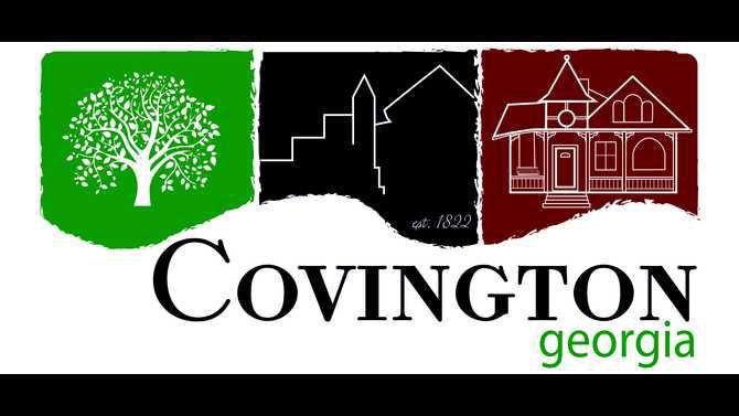
Featuring three modern, distinct icons in separate boxes, the logo consists of a large tree symbolic of an active lifestyle and recreation opportunities, the skyline of the Covington Square representing commerce and a historical house signifying the rich history and housing available in Covington.
“We work every day to position ourselves as the top place to live, work and play and this logo helps drive that home,” Mayor Ronnie Johnston said. “It is a fresh, clean, modern look for the city and is more in line with who are and where we are going than the previous logo.”
The city utilized the services of the University of Georgia Design Studio to help conduct research and create mock logos the city council reviewed. Before creating any logos, the Design Studio spent several days gathering data from a very diverse group of residents and visitors to determine if the city’s existing logo represented Covington’s current atmosphere and what a new logo should entail, if one was warranted.
“The responses we received from our polling exercise were overwhelming,” Public Relations Manager Trey Sanders said. “People felt our previous logo was dated and did not depict the current energy level and excitement in Covington. We are a thriving community that offers the unique ability to live, work and play in a historic, charming city and our new logo translates that.”
After reviewing approximately 200 logo designs and revisions submitted by the Design Studio, the city council determined a direction and city of Covington public media specialist Beth Ivey created the final version of the logo.
“Our new logo is engaging, versatile and representative of what is currently happening in Covington,” City Manager Leigh Anne Knight said. “We have some clever ideas about the future use of the logo and are excited about all of the possibilities.
“I would like to thank the mayor and city council for the opportunity to conduct this rebrand. A logo is often times a municipality’s first impression and we are pleased with the results of this process.”
The implementation of the new logo will begin immediately with digital content like the city’s website and Facebook page and will encompass new and improved signage and eventual repainting of the city’s largest water tower off of Hwy. 278.
“While we like the direction this rebranding process is taking us, we are going to be fiscally responsible during the implementation of the logo,” Knight said. “We will replace items branded with our previous logo as they are depleted and will implement the new logo in all forthcoming projects immediately.”


